 Share
ShareTechnology is moving pretty fast. I have no idea what I’ll be doing at 90, but this Grandma using the Oculus Rift headset is having a pretty good time! Google is also pretty close to publicly launching Google Glass, a wearable headset with a built-in computer. Growing up and watching SciFi movies, the weird and wonderful use of technology was always mind boggling but we are seing all these ideas become reality and they are slowly becoming part of our daily lives.
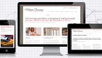
Tablet devices are also becoming part of this technology boom and such devices are slowly replacing laptops in both the home and business. This presents a number of challenges to both small and big companies and in particular how they will interact with their customers. Most businesses don’t have a responsive website that changes size to reflect the device it is being viewed on, and with the ipad mini outselling it’s bigger brother in the first quarter of this year, it’s clear that these devices are hear to stay and will change rapidly. Smaller-sized devices (around 8inch) are projected to have a bumper year, so it’s not just ipads, tablets, iphones and other smart phone that will be used to view your website and interact with your business. Responsive Web Design, over the next couple of years, will become (if it hasn’t already) standard and understandably design trends for the immediate future are clean and uncluttered where content is readable across all devices (this will be huge for ecommerce). Buttons that are clicked, links that are followed and copy that is written may all need to change so they have a desired impact.
Whilst these devices and their screens are only a small slice of the above mentioned customer interaction pie, they demand the effective delivery of any message or call to action so it can be understood or carried out. Look at your analytics packages now and see the multitude of devices that are browsing your website…