
 Share
ShareThere is no excuse for bad photography on a website. In fact, living in the digital age, there is really no excuse for bad photography to be seen anywhere, by anyone. At all. Ever.
It is not unheard of for one particular friend of mine to come back from holiday with over 2000 images, only to be whittled down to 25 of the very best to be produced proudly in one of those fantastic ‘photo-books’ that you can create online through various providers (we quite like www.photobox.co.uk). It’s amazing how even the most amateur of photographers (by their own admission) can capture some truly awe-inspiring images with a good camera.
Can you take your own?
If it’s not appropriate for you to take your own photography, perhaps because you need a very specific kind of product shot, then you may want to consider hiring a photographer (we can make recommendations to you). You should also remember that most web design companies such as Redhead Media will have access to literally millions of stock photographs and illustrations.
But I’m not just talking about good photography here. I wanted to quickly talk about using attention-grabbing photography on your website – the sort of photograph that serves a very important purpose – it makes the audience want to read the text that accompanies it.
A picture tells a thousand words
If you think about it, newspapers do it all the time. How often have you gone to the petrol station to pay for your fuel, and felt drawn to long line of newspapers, all dry and inviting in their little Perspex boxes. I would say that your attention is carefully ‘grabbed’ by the photographic editor of that paper, who chose an image for the front page that would generate some kind of response ranging from pure shock (tabloid) to curiosity (broadsheet). Of course this is backed up by the other all-important ‘attention-grabbing’ method – the ‘headline’, but for now I wanted to focus on image. After all – ‘a picture tells a thousand words’ and can be processed by our brains much faster than words can. In fact, according to research by 3M, humans process images 60000 times faster than text! This is because we take in all the data from an image simultaneously, while our brains process words in a sequence.
I’m not suggesting that you need to employ shock tactics of the tabloids in order to get the attention of your website users and entice them to read more, but here are a few things to remember when considering the photography/images used on your website:
- Remember who your audience is – it is their attention that you want to ‘grab’.
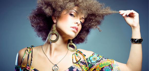
- Use bold colours (it’s a obvious one but worth mentioning). Even the most corporate, white-background design can be enlivened and made incredibly interesting with bold, colourful images.
- Use people and faces – humans are drawn to other people’s faces, especially if they are attractive or interesting-looking, or have an interesting expression.
- Use an image that people may not be expecting, but find a way to make it relevant to your text – for example, a web design page might use an image of a sharp, gleaming kitchen knife – it is unexpected but may be backed up by the headline ‘Cutting Edge Web Design and Development with a Difference’
Appeal to your audience
In summary; remember the important role that images can play in drawing attention to the key sales messages on your website. Think about the use of colour, faces, expressions and ‘the unusual’ or ‘unexpected’. Always appeal to your audience, and of course back it up with great copy, that encourages them to take action. You have their attention – now make the most of it!